
Choosing the Right Plot for Your Data
Aug 24, 2025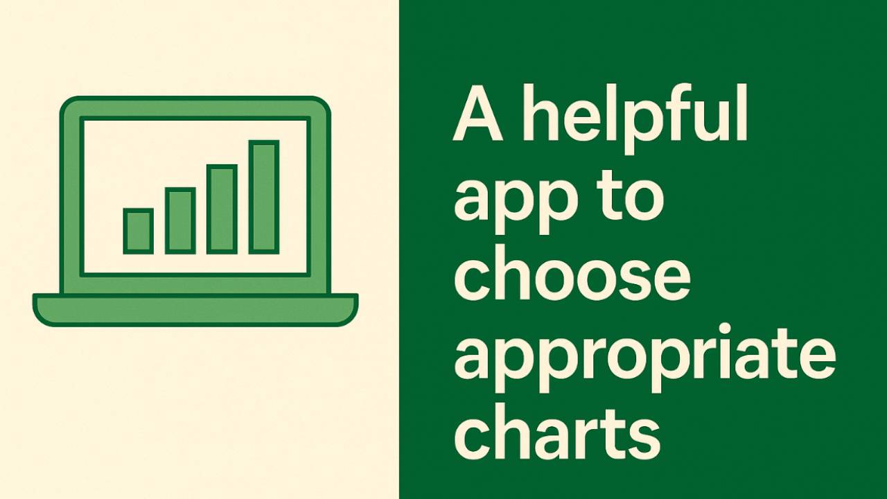
One of the biggest mistakes I made early in research was thinking that any graph was good enough as long as I “showed the data accurately.” A bar plot here, a line graph there—it didn’t matter, right?
Wrong.
The truth is, the way you visualize your data completely shapes the story people see. If you choose the wrong type of plot, you risk confusing your audience—or worse, misleading them.
Matching the Plot to the Question
Here’s the rule I wish someone had told me on day one:
Depending on your data type, use the right plot to tell the story.
- If you’re comparing categories, maybe a bar plot or dot plot makes sense.
- If you’re looking at relationships between variables, scatterplots are your best friend.
- If you want to show distributions, think histograms or boxplots.
Each plot has strengths and weaknesses, and your job as a scientist (or student) is to match the data with the right tool.
A Tool That Makes It Simple
There’s actually a great resource that takes the guesswork out of this: Data to Viz.
It’s an interactive guide that walks you through:
- What kind of data you have (numeric, categorical, time series, etc.)
- What you want to show (comparisons, trends, distributions, relationships).
- Which plots make sense for that situation.
It even warns you about “misleading” or “weak” chart types that you’ll see misused all the time.
Why This Matters Beyond the Classroom
In science, communication is everything. You can spend years on a project, but if your figures are confusing, no one will understand your results.
The right plot doesn’t just make your work look better; it makes it easier for others to trust, build on, and remember.
So the next time you’re about to drop your data into Excel or Prism or RStudio and click the first chart type you see, pause. Ask yourself: what story am I trying to tell? Then let that story guide your choice.
👉 Check out the interactive app here: Data to Viz. It’s one of the most useful (and free) resources I’ve found for learning how to choose plots wisely.